
CLIENT
S. Rajaratnam School of International Studies (RSIS)
ROLE
Design – Concept sketches, wireframing, storyboarding, design prototype. Research – Semi-structured interviews, affinity mapping, competitive analysis, expert evaluation.
DURATION
36weeks
TOOLS
Sketch, Figma, Marvel,
TEAM
Jim, weekiang
The S. Rajaratnam School of International Studies is an autonomous graduate school and policy-oriented think tank of Nanyang Technological University in Singapore.
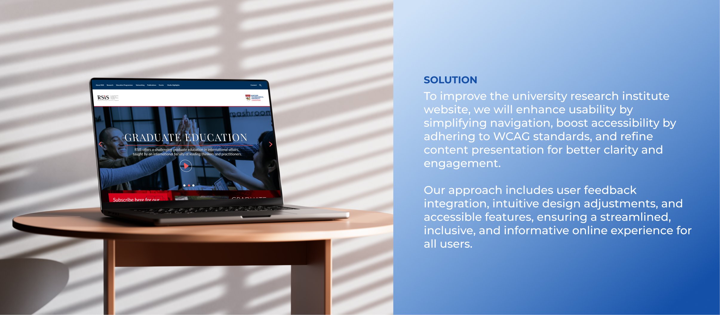
Redesign the university research institute website to elevate usability, accessibility, and content presentation. Focus on streamlining navigation, meeting accessibility standards, and optimizing content layout for clarity and engagement. Develop a user-centric design that enhances the efficiency and inclusiveness of the online experience, ensuring that all visitors can navigate and interact seamlessly.
In order to establish good communication with the client, I requested that all team members thoroughly review the project materials and consider any questions they had regarding the product or its interactions. I then compiled these questions into a unified document and presented them to the client, ensuring that all concerns were addressed. We needed to know who the target audience is to help make decisions on styling and subject matter as well as specifics of what information is needed during an initial account onboarding. We were able to gain more clarity through these key takeaways:
• Target audience is researcher but also accommodates users in students and professionals and for personal self-study.
• Current site (parent company) too bland and lacks inspiration and more overly complex elements.
• Minimise the number of clicks for user to complete their goal.
• Clear visual hierarchy that can easily distinguish between different types of content.
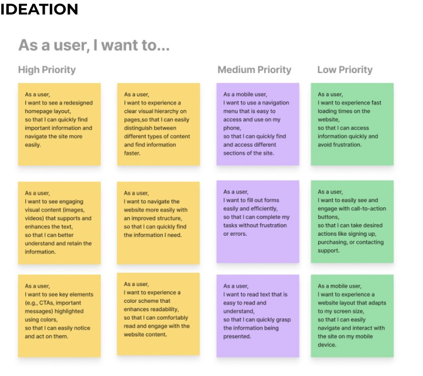
User stories most vital to the MVP for the client were submitted to the project manager. These involved some of the basic functions of the application. Further development would be built on the foundation we set.
As a user, I want to navigate the website more easily with an improved structure, so that I can quickly find the information I need.
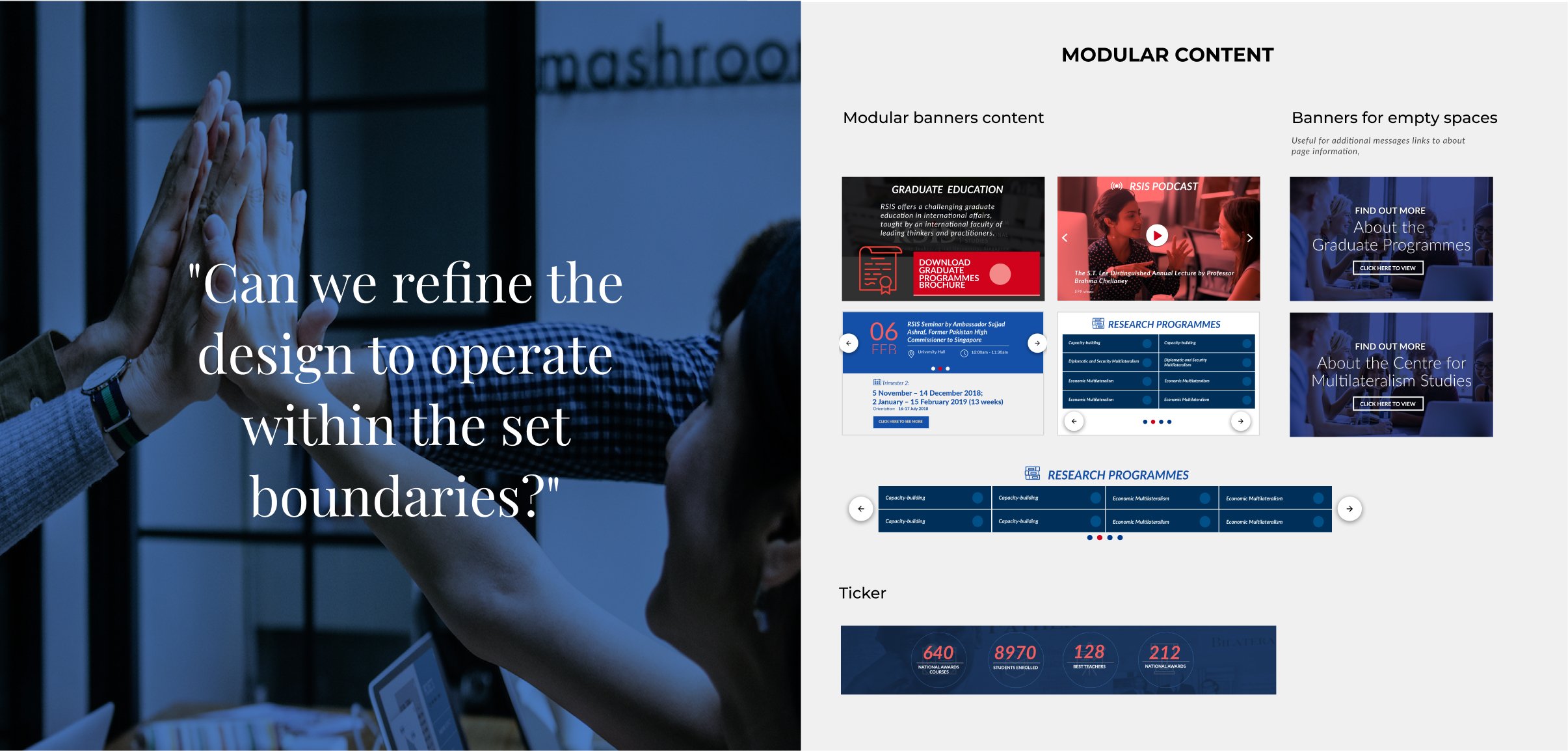
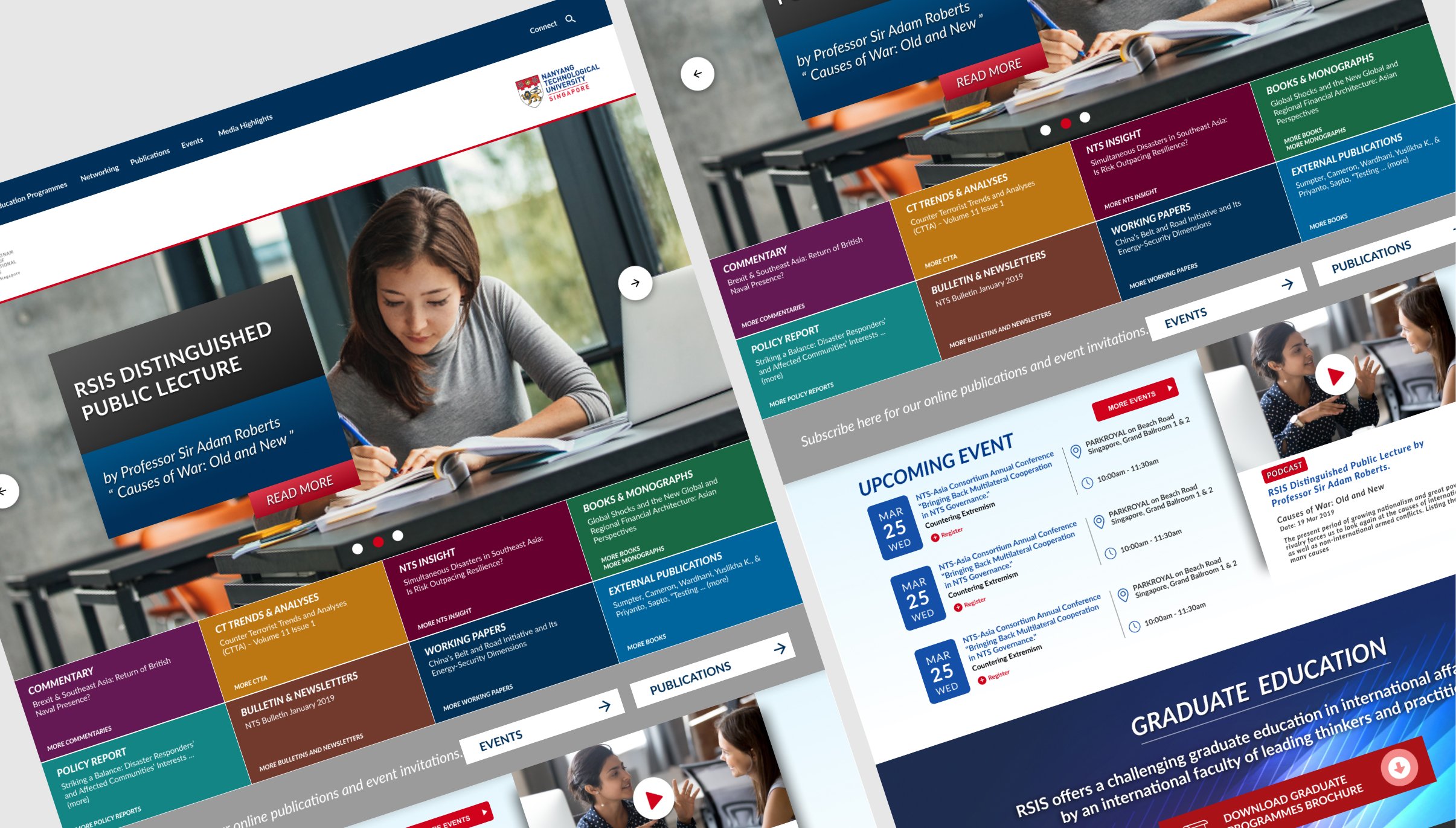
As a user, I want to see key elements (e.g., CTAs, important messages) highlighted using colors,
so that I can easily notice and act on them.
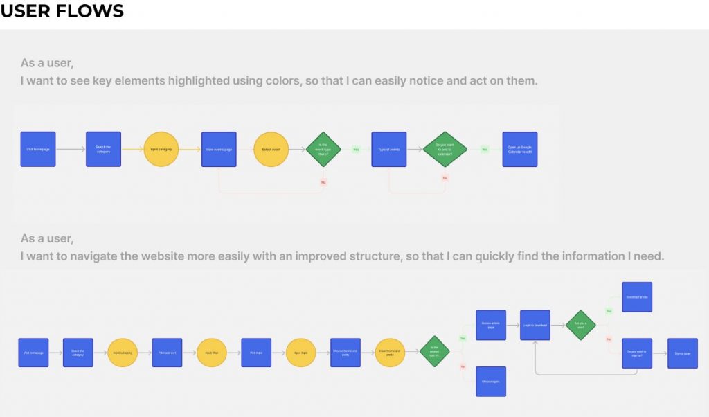
With the established user stories as a guide, the team developed the user flows by initially working individually, and later presenting and iterating on them in group sessions. The objective was to deliver on each user story in the most streamlined and intuitive manner possible.
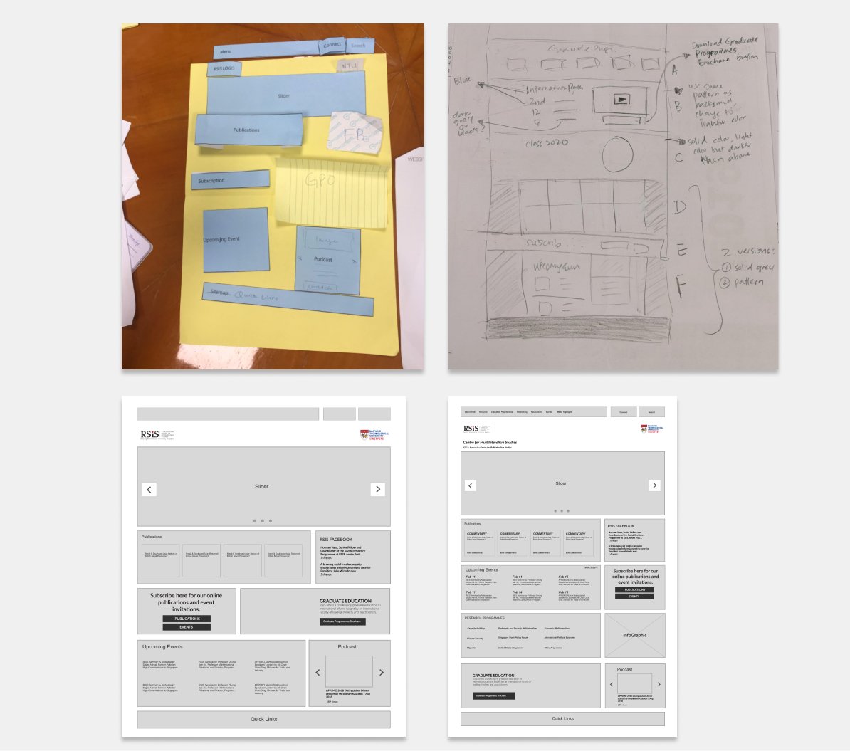
In the initial stages of our design process, I began by brainstorming ideas using paper cutouts to rapidly explore and visualize concepts. This low-fidelity approach allowed us to quickly identify and discard unsuitable ideas.
As our concepts took shape, I transitioned the team to sketching, enabling us to refine our ideas and introduce more detail. This phase helped us solidify our user flows and identify key screens.
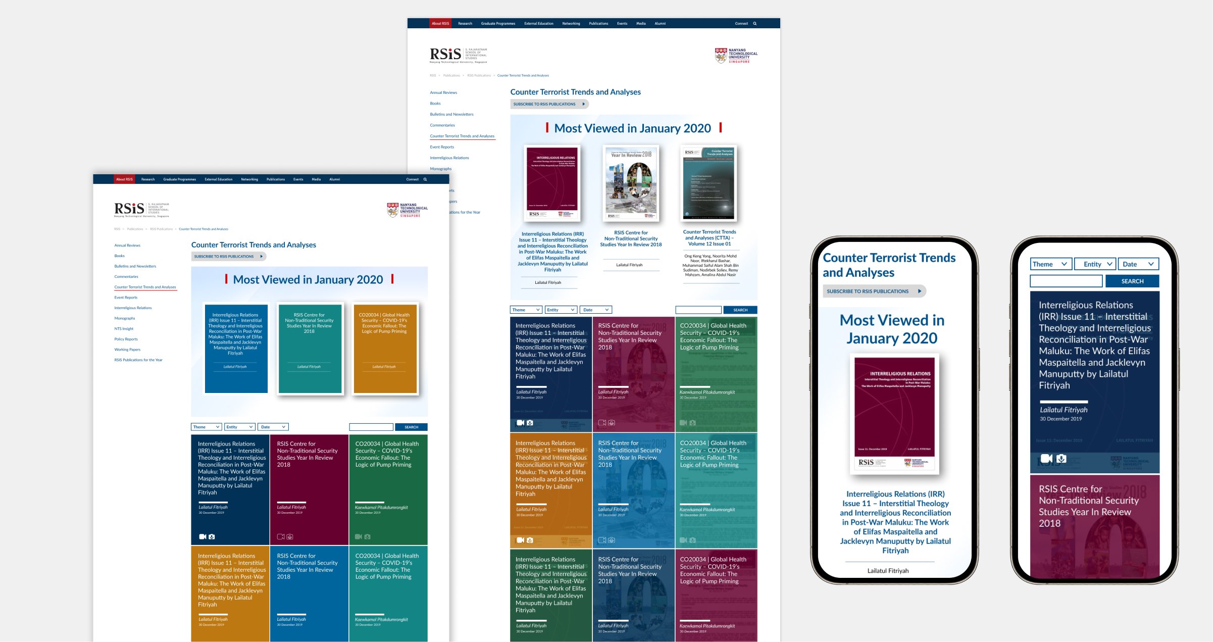
With a clear direction established, we progressed to mid-fidelity wireframing. I assigned wireframes according to the user flow each team member had previously worked on, ensuring continuity and consistency. Given the responsive design requirements, we prioritized mobile-first designs, followed by desktop versions.
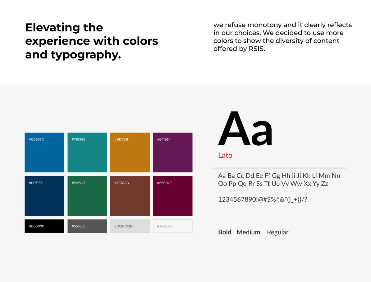
After collaborating on UI inspiration and color exploration, our team aligned and established a functional color palette. We then proceeded to define and fine-tune the remaining brand attributes. To expand upon the brand’s current identity and intended goals, i conducted a colour exploration using various tones.
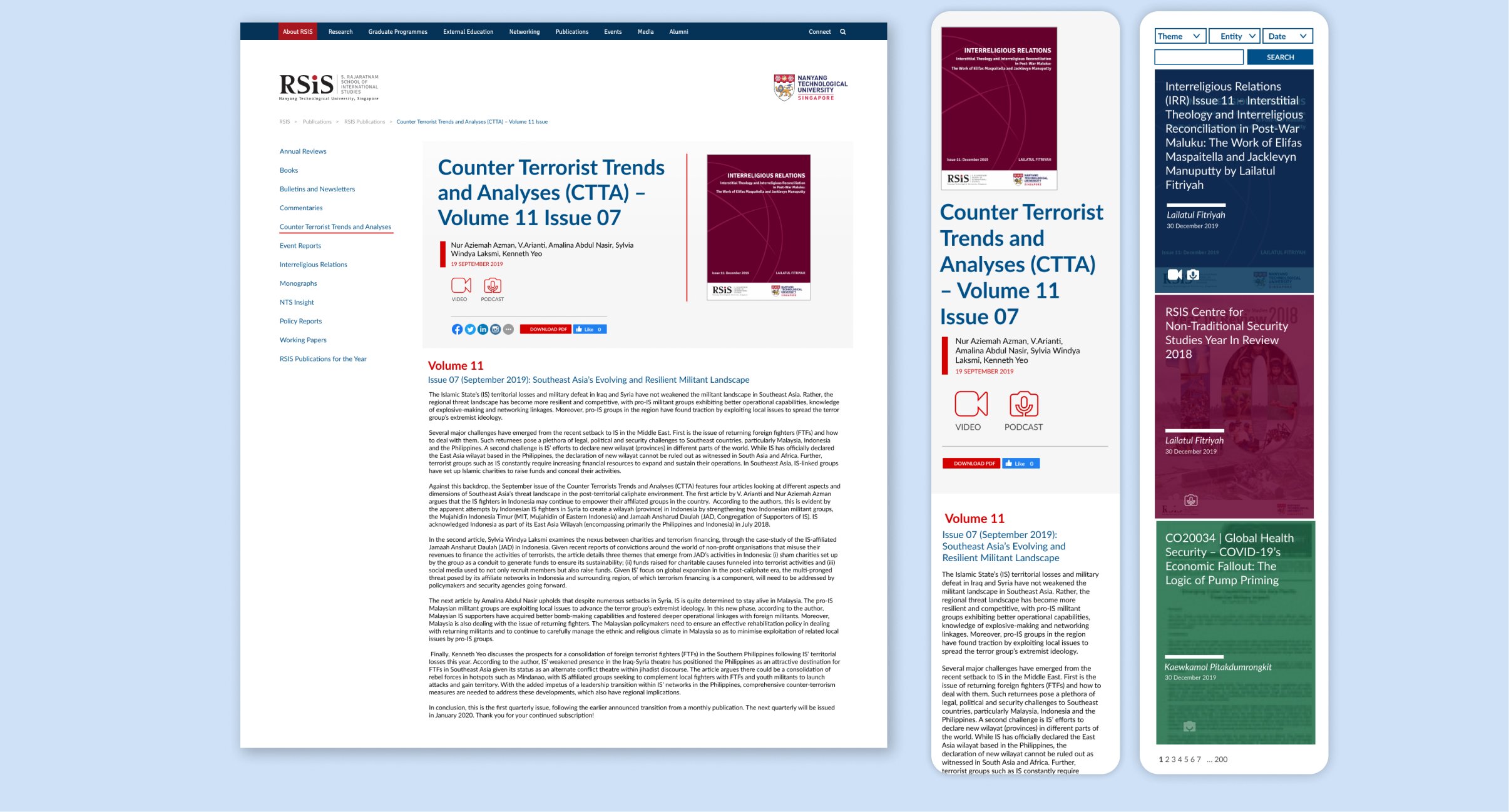
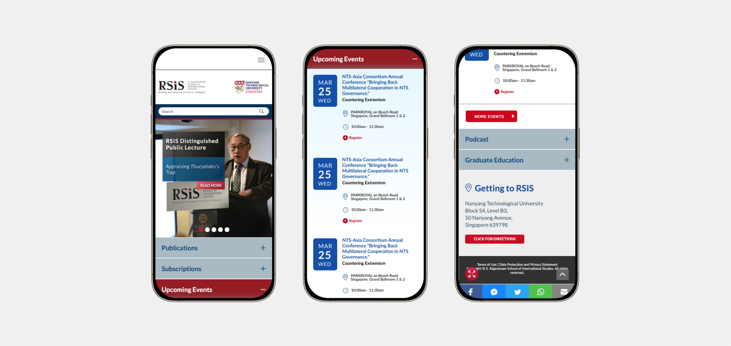
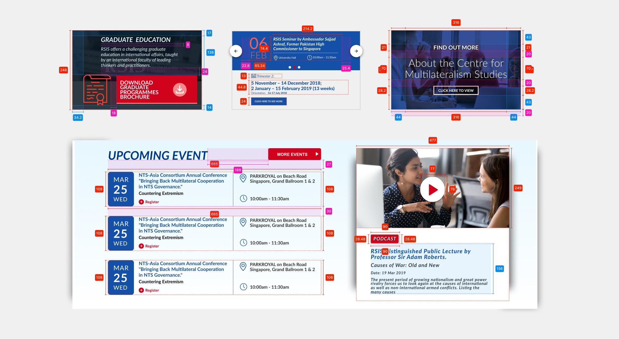
As we waited for the client’s feedback on the HiFi screens, I initiated work on the developer handoff. Each designer took responsibility for their own workflow and employed a plugin called Measure to annotate the screens for the developers to follow. This was done to ensure that all spacing and padding were accurate, and that interactions were clearly described to avoid any ambiguity about how certain actions were executed in a user flow. Designers also annotated interactions between screens to ensure the developer and client understood the actions that led to interface or screen changes.
Our team crafted a comprehensive brand passport that encapsulated RSIS essence and provided a roadmap for the project. Leveraging insights from the Discovery process, we developed a website design that perfectly balances premium aesthetics and distinctiveness.
Through strategic repositioning and thoughtful design execution, we achieved the goal of establishing a more mature brand identity and attracting the right clients, setting the stage for continued growth and success in the digital landscape.
I hope you enjoyed your stay.
If there is something you wish to know, feel free to connect with me.
© 2025 All Rights Reserved.