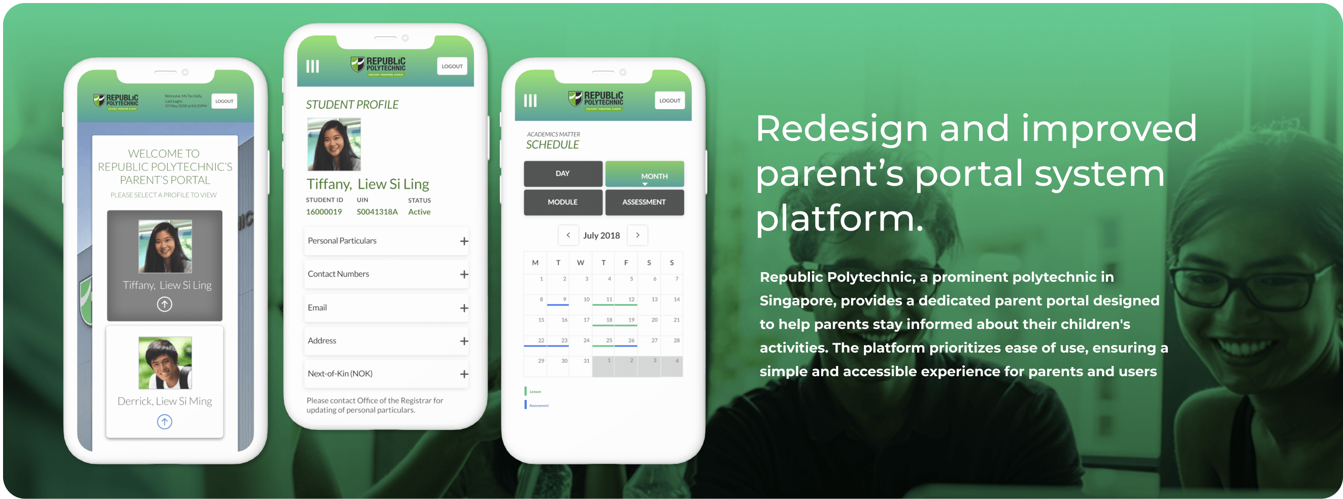
Parents and school staff struggle with inefficient booking systems for school-related events, leading to scheduling conflicts, low transparency, and frustration. A user-friendly, mobile-optimized platform is needed to simplify the process, improve accessibility, and increase engagement.
Solution
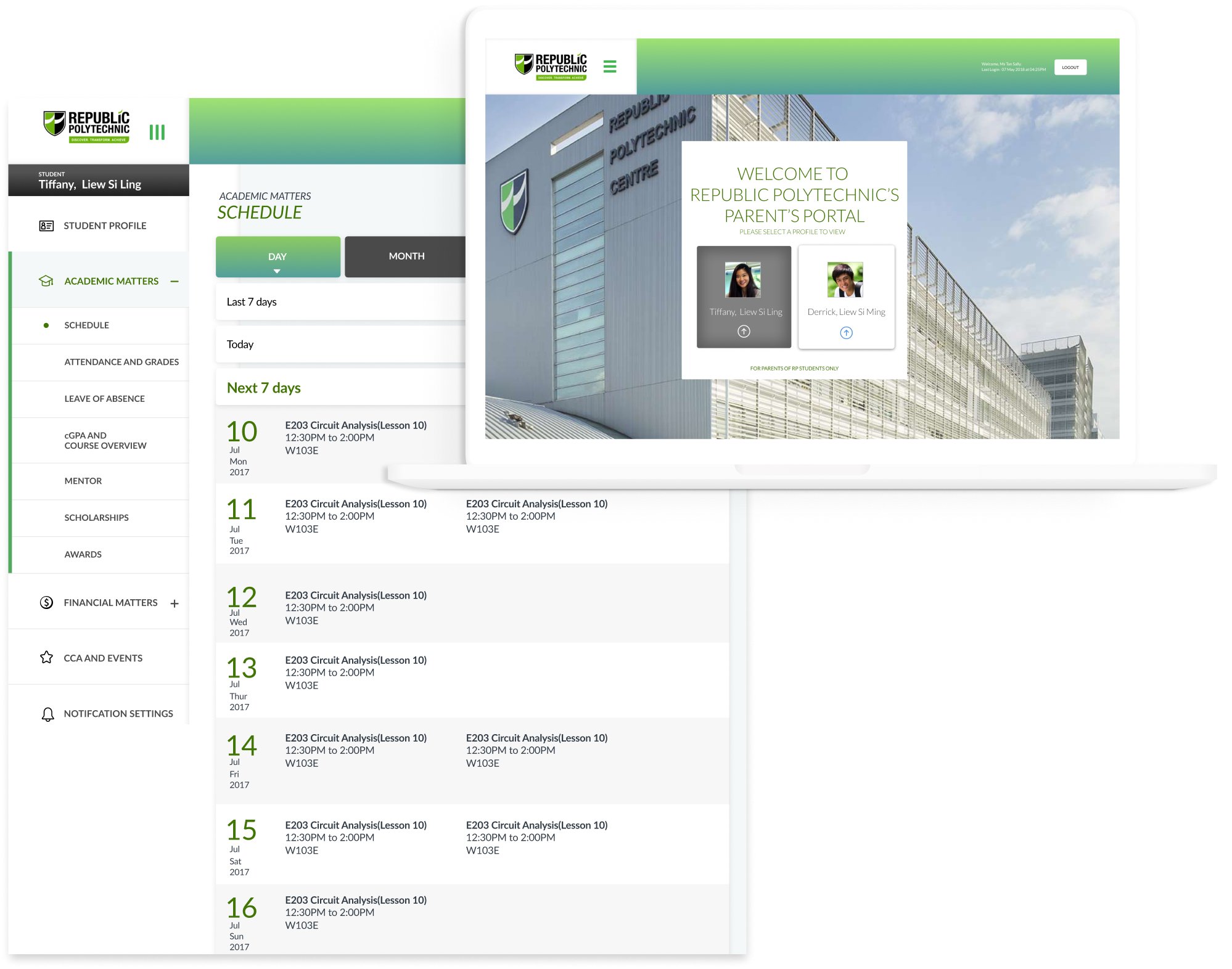
A visually appealing design that is easy to understand and navigate will help parents find what they need quickly. By incorporating a user-centered approach and following best practices in UX/UI design, the portal can effectively serve both parents and the school, making their interaction smooth and efficient.
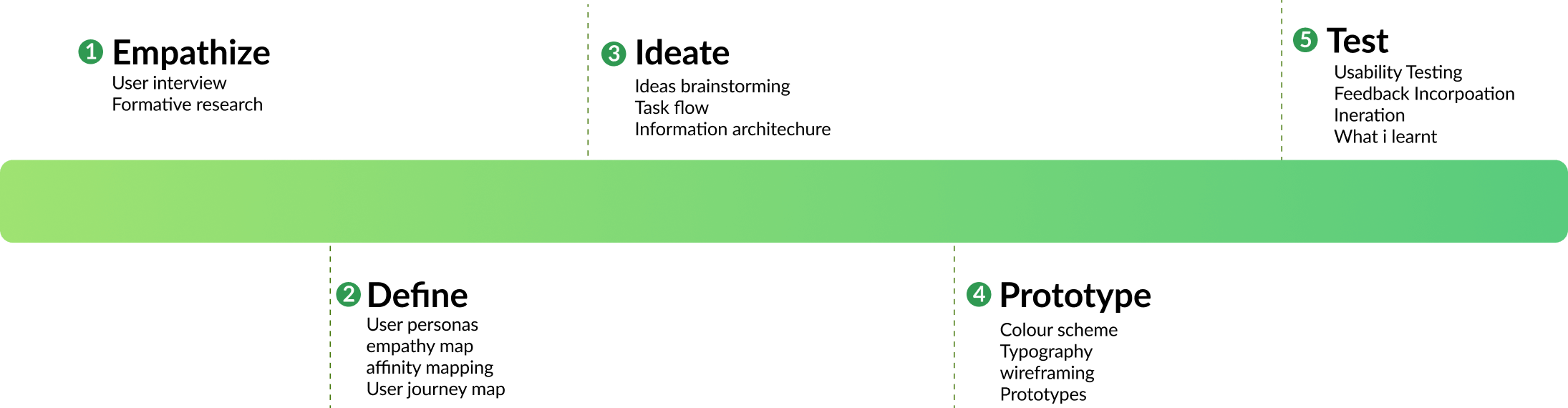
KICK OFF
My team and I worked closely with the client, starting from discovery to creating a proof-of-concept prototype. During our kickoff, the client shared their vision and priorities, which helped shape our process. We conducted research like user interviews, task analysis, and usability testing—some of which involved school stakeholders who were also parents and part of the client team. While my teammates focused on research, I led ideation, set up a design system, and prototyped solutions that balanced the client’s goals with user needs.
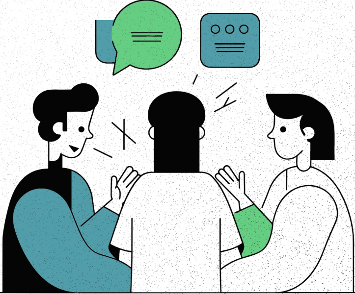
1.Conduct User Interviews
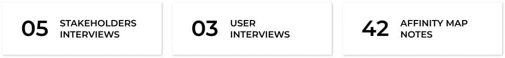
We conducted user interviews with three parents and five stakeholders, including client representatives who were also part of the school community. The goal was to understand their needs, pain points, and expectations for the parent portal. Through structured conversations, we explored how they currently track their children’s activities, identified challenges, and gathered feedback on potential solutions.
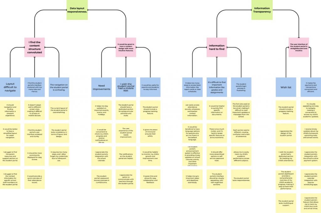
Organize the Research Data
After completing the interviews, we organized the raw data to uncover patterns and insights. Using affinity diagrams, we grouped key quotes, observations, and findings from parents and stakeholders into themes. Common themes included the need for a more intuitive interface, real-time updates on student activities, and easier navigation for busy parents.
Identify User Needs and Pain Points
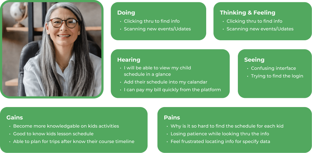
After organizing all the research data, we dug into understanding what our users really needed and what was frustrating them. To make sense of it all, we created personas and empathy maps—these helped us step into their shoes and see things from their perspective.
What stood out were pain points like struggling to get timely updates, dealing with a confusing interface, and juggling too many platforms. On the flip side, users wanted something simpler: a more intuitive design, real-time notifications, and one place to track everything about their kids’ activities.
Needs
“I need to get thing done quickly”
Pain
“It’s frustrating to finding the info.”
User Jounery
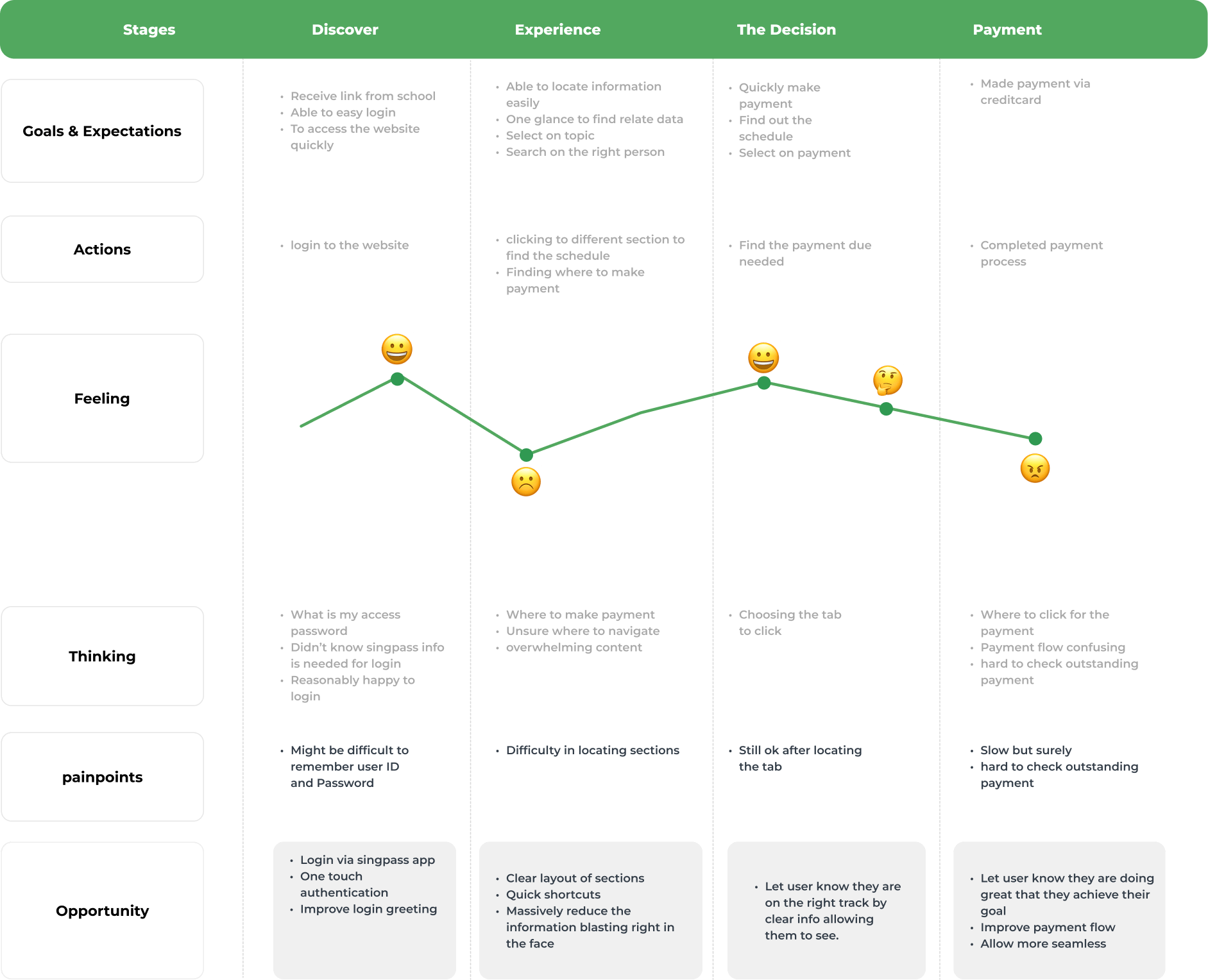
We mapped out the user journey to visualize the steps parents take to complete key tasks, such as checking their children’s activities or accessing important updates. This helped identify pain points, like confusing navigation and delayed information, while also uncovering opportunities to simplify the process. By understanding their journey, we were able to design solutions that make the experience smoother, more intuitive, and better aligned with parents’ needs.
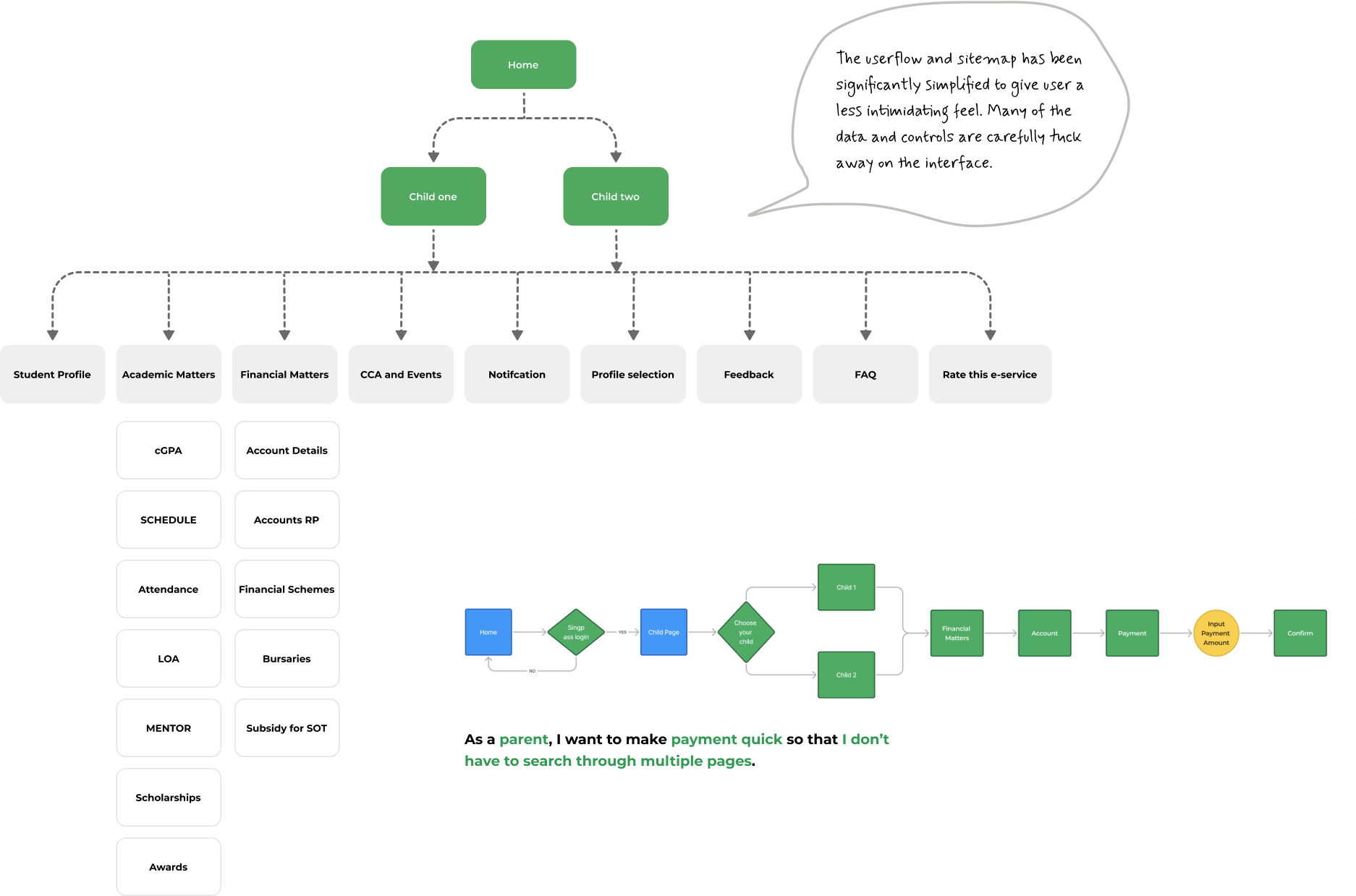
As a parent, I want to make payment quick so that I don’t have to search through multiple pages.
Step 6: Write User Stories User stories based on research insights to outline what parents needed, like easy access to updates or checking activities. These stories guided our design, ensuring we focused on solving real user problems.
As a parent, I want to see all the courses in one place so that I don’t have to search through multiple pages.
As a parent, I want to receive reminders for my bookings so that I don’t forget about them.
As a parent, I want to make payment quick so that I don’t have to click through multiple pages .
Step 7: Site map, userflow
After gaining a better understanding of my users’ needs, I developed a sitemap with the goal of aligning trusted resources with a simple task management system to organize what can be overwhelming into a manageable process.
3. Ideate
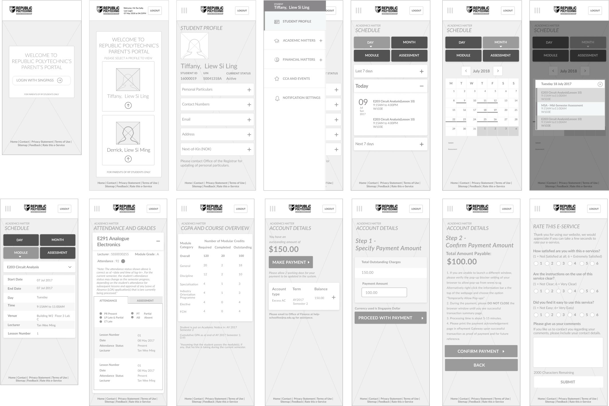
Wireframes In the initial round of medium-fidelity wireframes, I iterated multiple designs for each user flow. I evaluated whether I was effectively addressing the red routes by cross-referencing them with the HMW statements and sketches. These iterations helped me refine how I presented information and essential features. As some screens, such as the professional service detail pages, contained a lot of information, I paid special attention to the organization of the content to make it easier for users to comprehend.
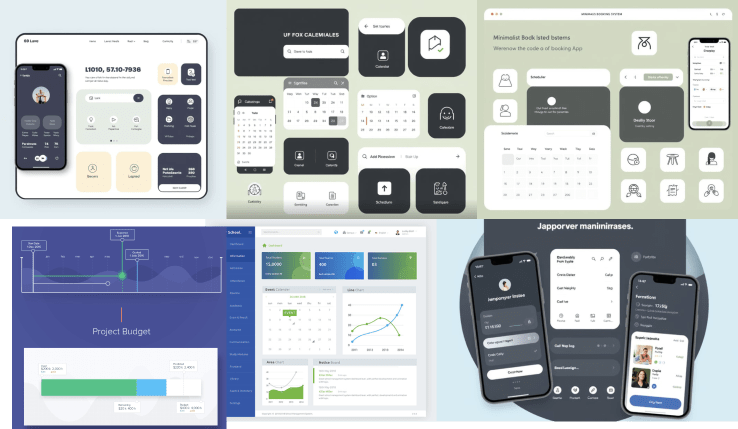
Moodboard
Following some preliminary research and careful consideration of how to bring this brand to life, I honed in on the essential qualities to attain desired outcomes: reliability, the capacity to interact with fellow users, and the capability to share information.
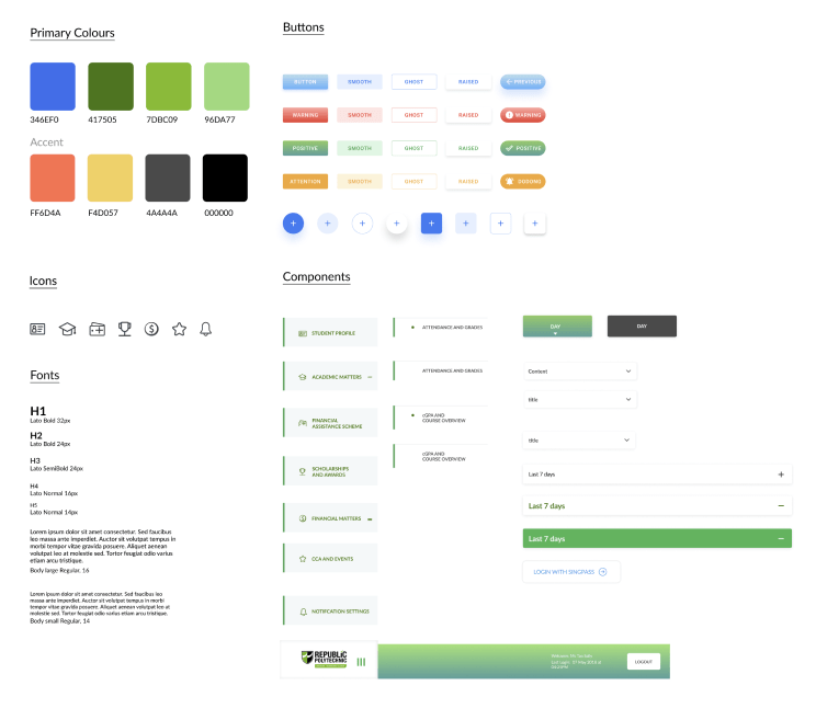
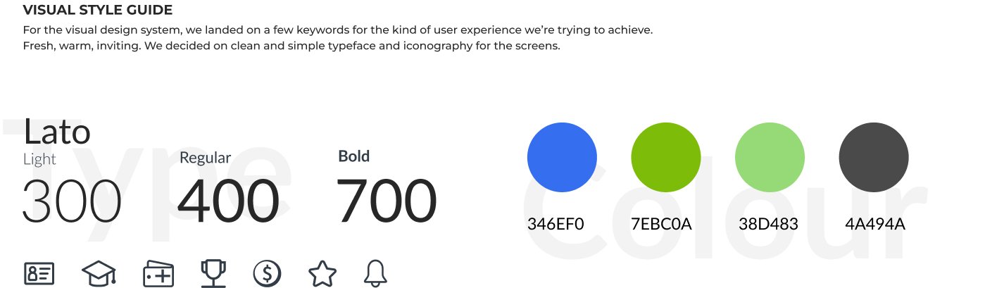
Style Guide
To establish a consistent visual language, I started creating the design system with the wordmark, emphasizing a clean and minimalistic style. I maintained this aesthetic throughout the application to prevent overwhelming users with information complexity. I opted for a green color palette to reinforce the notion of dependability and establish the app as a trusted resource.
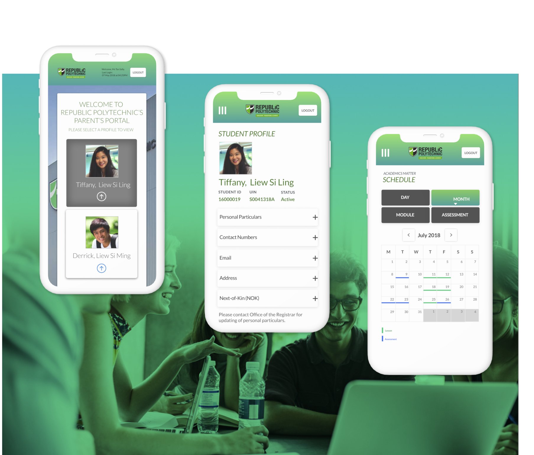
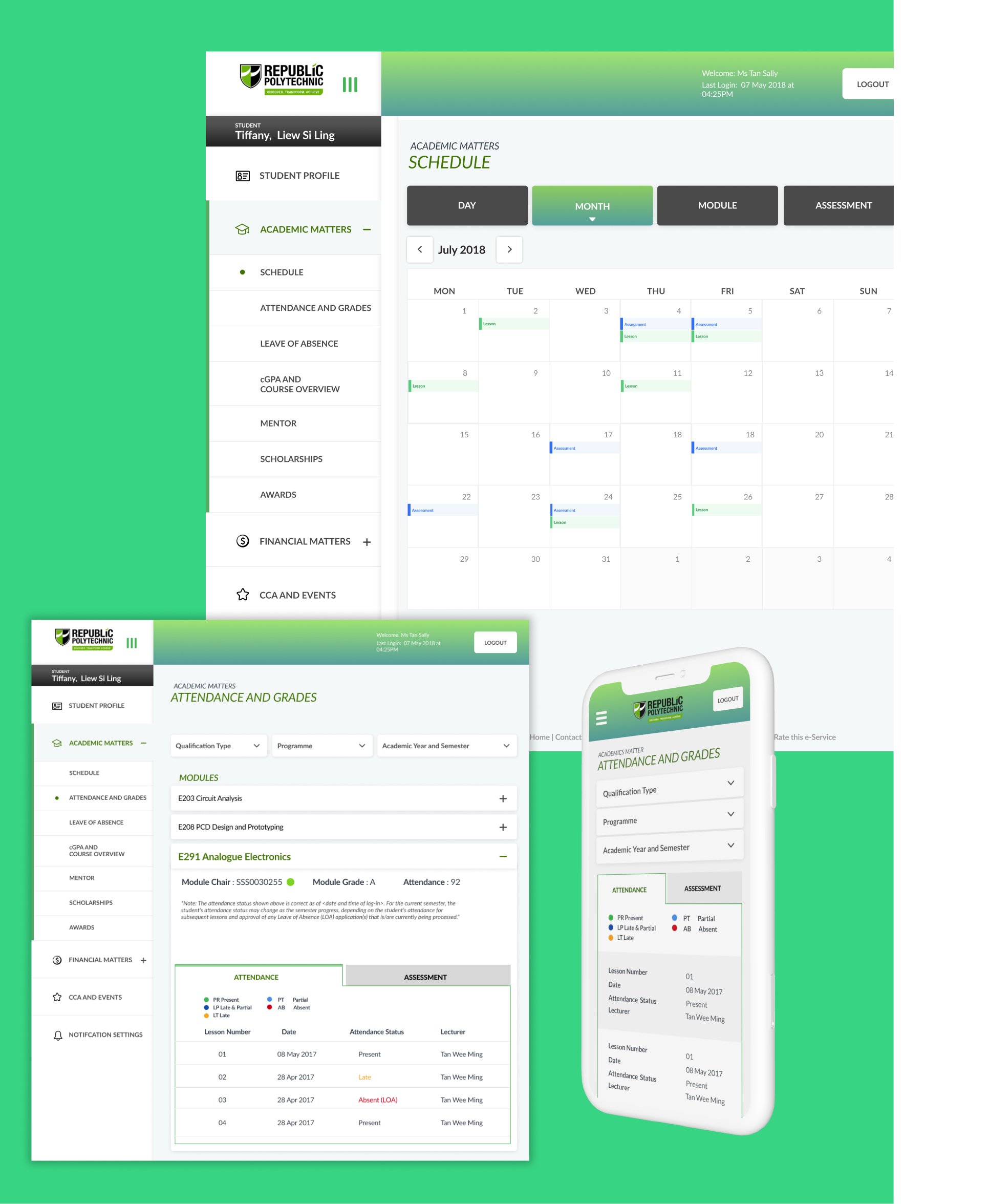
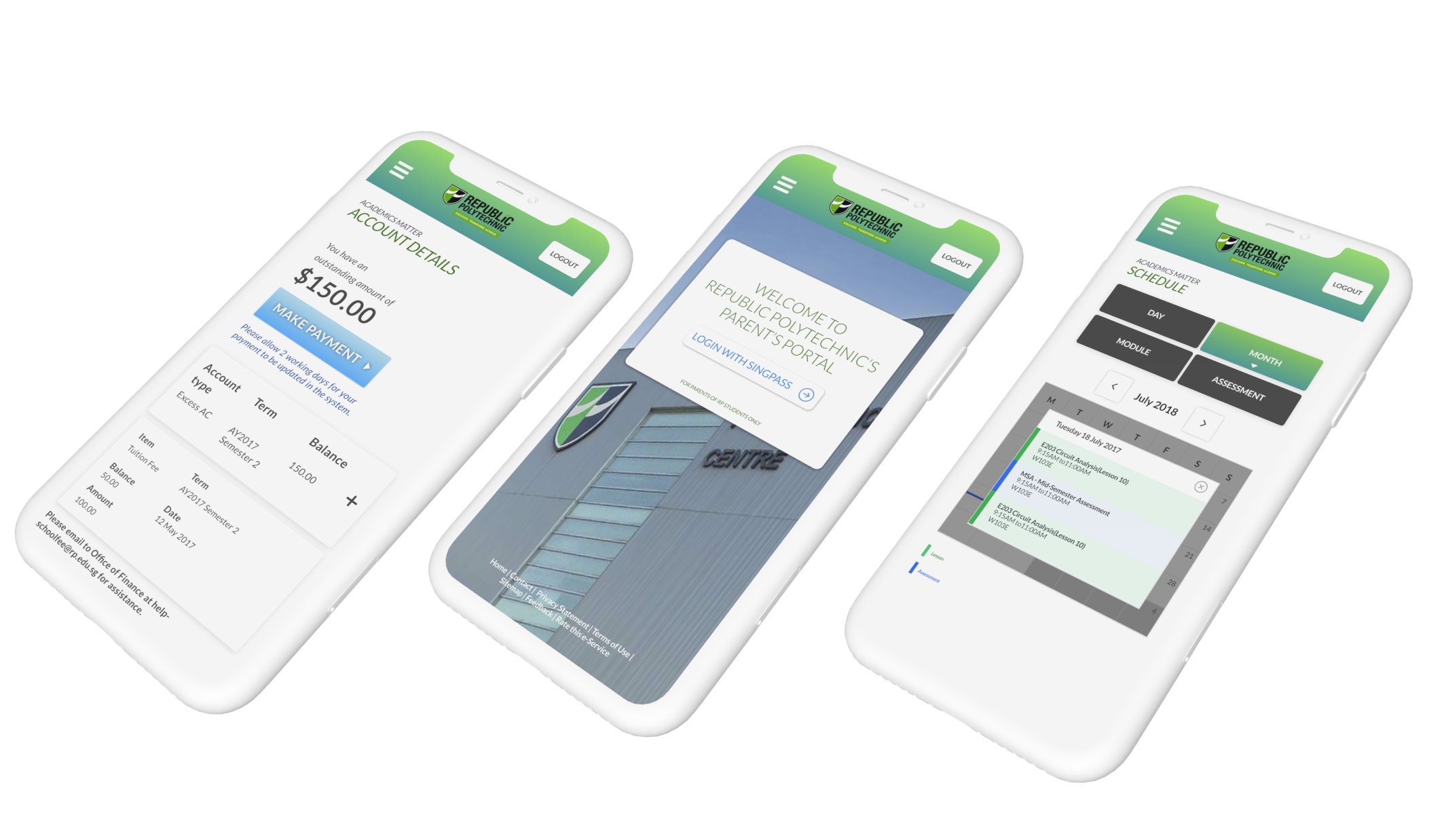
High Fidelity Screens
To kick off the creation of high-fidelity (HiFi) designs, I focused on the most critical screen for each workflow. Analyzing the application of color also helped me identify which design components were effective. However, I had to strike a balance between content and color to prevent overwhelming the user. During the design process for the How-To screen, I realized that the button layout in the wireframes was confusing when colored. To address this, I refined the layout into a tab bar at the top of the page. This enables users to switch between various sections of the How-To content seamlessly.
4. Design Prototype
Usability Testing
User Testing Overview I conducted one round of user testing with 5 Users. I set out to understand the following: How users interact with the application interface while completing a task. Any elements that cause confusion or frustration for the user, such as buttons, navigation, and labeling. Any missing or redundant information. That the overall design is intuitive and easy to navigate.
Insights
Increased Parental Engagement:
The student portal has led to increased parental engagement by providing easy access to important information such as grades, attendance records, and upcoming assignments. Parents are more involved in monitoring their child’s progress and can support their academic journey more effectively.
What can we do next
Personalization Features:
Implementing personalization features that allow parents to customize their portal experience based on their preferences and their child’s individual needs can enhance usability. This could include customizable dashboards, notification settings, and personalized recommendations tailored to each parent and student.