CLIENT
Airplus SmartMask
ROLE
Design – Concept sketches, wireframing, storyboarding, design prototype. Research – Semi-structured interviews, affinity mapping, expert evaluation.
DURATION
20 weeks
TOOLS
Sketch, Figma, Marvel, Zeplin, WordPress
TEAM
1 Researcher, UX Designer, 1 Engineer
An award-winning brand for face masks from Singapore, AIR⁺ combines an ergonomic, protective N95 mask with the world’s first attachable Micro Fan to reduce build-up of trapped heat, moisture and carbon dioxide to deliver active circulation of fresh cool air with every breath.
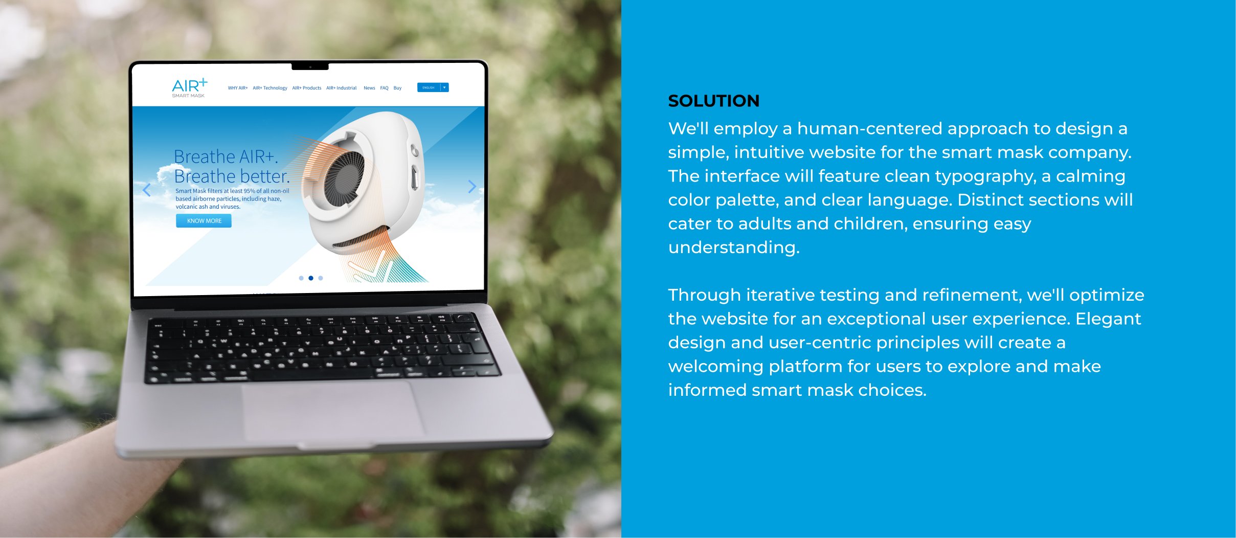
Designing an intuitive UX/UI for a smart mask company’s website, catering to both adults and children in the general public, requires a thoughtful approach. The interface should feature a clean and classy design while maintaining a friendly and approachable feel. Simplicity and ease of understanding are key, ensuring users can effortlessly navigate the website and access information about the smart masks. By combining a clean and classy aesthetic with user-centric design principles, the website will create a welcoming and user-friendly platform for adults and children to explore and make informed decisions about their mask choices.
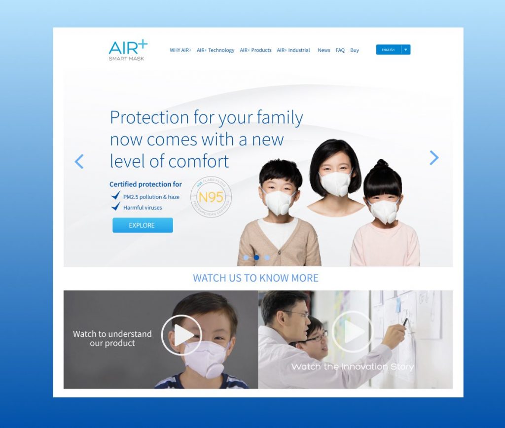
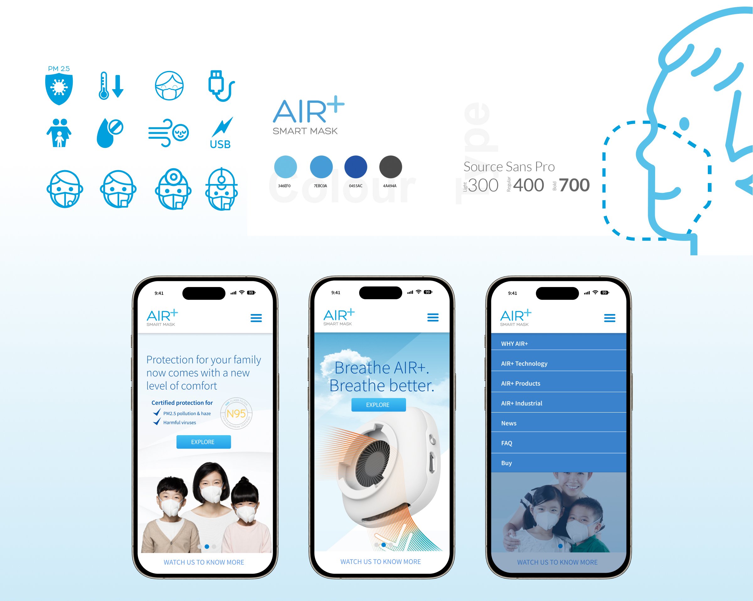
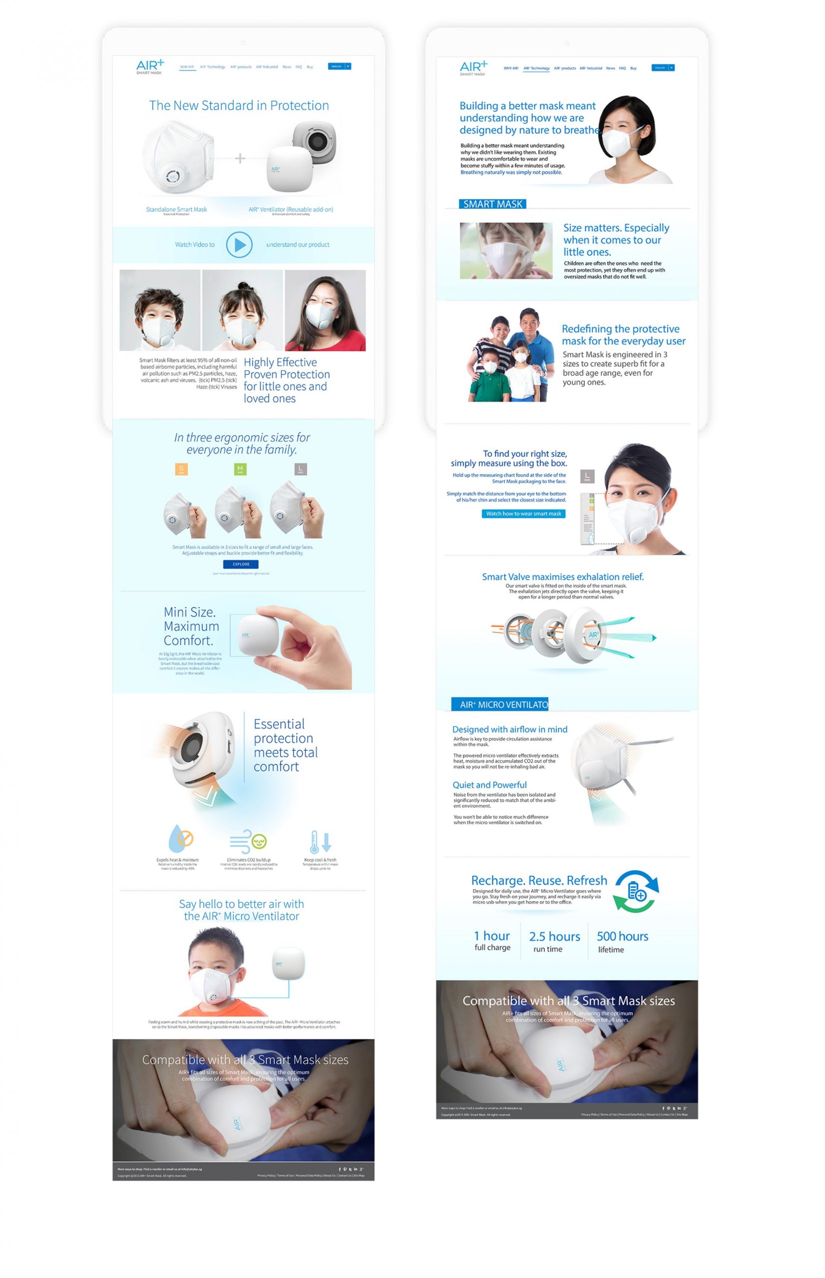
Through our discussions, it has become clear that a primary obstacle to converting website visitors into customers is the complexity and ambiguity of our current online experience. To overcome this, we recommend prioritizing simplicity, clarity, and accessibility in our website redesign, ensuring an intuitive and engaging experience for users of all ages.
“Our target audience needs to easily understand the benefits and features of our smart masks.”
“Our redesign should focus on streamlining navigation, using clear and concise language, and incorporating visual elements that communicate our brand’s unique value proposition.”
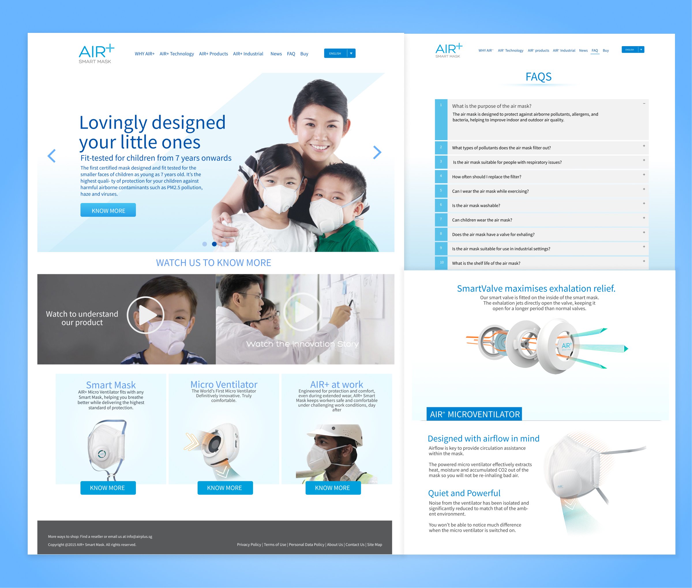
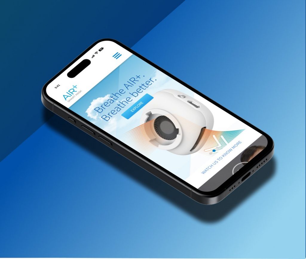
Post-redesign, our website has seen notable improvements in user engagement and conversion. The revamped interface has successfully conveyed our smart mask value proposition, yielding positive user feedback and reinforcing our brand’s reputation for innovation and trust.
I hope you enjoyed your stay.
If there is something you wish to know, feel free to connect with me.
© 2025 All Rights Reserved.